


Some of the pages on your website are more important than others. Okay, many of you probably find that fairly obvious — but I’m surprised how few people actually apply this knowledge to their websites to improve conversions.
I’m all about low hanging fruit; about undertaking the easiest tasks that will have the biggest results. What I’m about to describe in this article has the potential to improve your site dramatically with just a few, critical changes.
Let’s get right into it. Every website is different, but generally speaking, here are the four most important (and most-visited) pages on a website:
- Home Page
- About Page
- Blog
- Contact Us Page
In this post, I’ll explain how to optimise each one of these pages. (And if your most-visited pages are different than the ones listed above, you’ll still learn a framework for optimising any of the important pages on your website.)
What do I mean by “optimise” a webpage?
You’ve probably heard the word “optimise” most commonly used in phrases like “search engine optimisation” (SEO) and “conversion rate optimisation” (CRO). I’m actually referring to something broader here, but the advice that I’m delivering will help to enhance both of those.
The optimisation I’m going to explain will create user optimised pages. In the pursuit of SEO and CRO, it’s easy to overlook the broader, big-picture idea. First and foremost, a site must be optimised for the user. Here’s how you can do that.
How to Optimise Each Page
The broad framework for optimising these pages the same across your home page, About page, blog, and Contact Us page. There are two simple questions to ask of every page, and the specifics of optimising those pages will flow from the answers to those two questions. The first question is all about the user, and the second question is all about you. Here we go:
Question 1: What is the user looking for?
Remember, we’re focusing on the user. Why are they on the page to begin with? There are a few things you need to know:
- Where did they come from?
The idea here is to understand the origins of the user, so you can deliver relevant content.- Did they come from a search engine? (If so, which query?)
- An email? (What kind of email?)
- A navigation menu? (What option on the menu?)
- What do they need to know?
A single page can deliver a limited amount of information, so you need to determine what that information is going to be. You want them to know something so that they will then do something (which is addressed in the next question). Remember: Less is more. The more information you load up on your main pages, the less likely the user is to remember any of it. Give them less, and they’re more likely to remember — and do — what you want them to.
Pro Tip: Use visuals such as explainer videos, diagrams, hero shots, and so on to help compact a lot of information to a single page. To get the most out of your visuals, make sure you correctly optimise your images and videos.
Once you answer the question of what the user’s looking for, you’re halfway there. That brings us to question two.
Question 2: What is my goal for the user?
Now, you need to ask the user to do something. This is where most pages fall short. One of the critical components of a web page is its call-to-action (CTA), and many website owners don’t realize that every single page of a website should contain at least one CTA.
The point of a home page isn’t for the user to see and depart. The point of a product page isn’t for the user to look and leave. The point of content marketing isn’t for user intake, but rather, for user marketing. If you retain only one thing from this article, let it be that every web page needs a CTA.
Why am I so insistent? Because every shred of knowledge demands some response: A web page imparts knowledge, and that knowledge requires a response. So, what is it that you want the user to do? This is your goal for the user, and it must be clearly and starkly defined as you face the big optimisation question.
The question is then, more specifically, what do I want the user to do? Knowledge alone is not enough. What is the application point for the page? Let’s look at some examples of web pages that do it well.
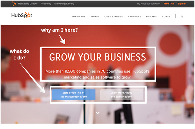
HubSpot’s Home Page
HubSpot’s home page is well laid-out and hosts a clear CTA, front and centre. A user is on the HubSpot home page for a reason, and perhaps that reason is to grow their business. The headline speaks to the “what am I looking for?” And the CTA buttons tell me, the user, what I’m supposed to next. (The white annotations are my own, not Hubspot’s.)
Now, let’s see what HubSpot has going on, on the about page.
HubSpot’s about Page
A user might click on the about page for a variety of reasons. A few might be:
- They want to figure out exactly what the business does.
- They want to work for the business.
- They want to make sure the business is legit.
- They want to see if the business serves their niche or location.
- They want to analyse the business’s success.
I could go on and on. There are a ton of reasons that could bring a user here, but they all boil down to the desire for information. Let’s see what HubSpot does. Here is their About page:
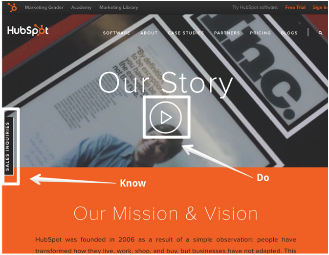
The user likely wants to know the information about the company, and in response, he or she can click “sales inquiries” to take action. That persistent sidebar button hangs on to the entire page, all the way to the very bottom.
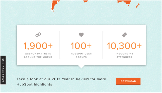
Along the way, however, there are deeper levels of both information and action. The more granular and detailed the information, the more correspondingly detailed the CTA becomes. Halfway down the page, I see information about how great the company is along with an invitation to join their team:

There’s more. I can download information about highlights and awesomeness:
Finally, I can start following them if I’d like to:
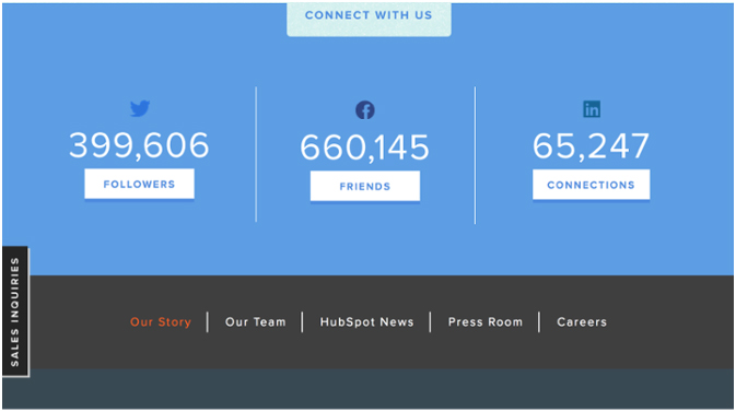
This is an example of an About page optimised to drive engagement, increase conversions, and enhance the brand. They made it as much about the user as about the company itself, because along the way, the user is getting value — applying for a job, downloading a free report, and connecting with a trusted brand for even more valuable content.
Tips for Optimising Each Page
Now that I’ve given you a framework and a couple examples, here are a few, more specific tips to help you on your way to optimising each of the four most important pages.
1) Home Page
- Use a big headline, and place the most important information front and centre.
- Provide flow. Make it obvious where the user is supposed to go and what they are supposed to do next.
- Make your CTA as big and obvious as possible. A home page may allow for several different CTAs — make it easy for the user to choose by making CTA buttons large and easy to click. Oftentimes, a user uses the home page as a way of finding where on the site she wants to go. For this reason, you should make the navigation menu very clear.
2) About Page
- Deliver the most important and relevant information above the fold. The user is on your About page for a reason — answer their question(s) without making them scroll.
- Include at least one CTA. Remember, most people aren’t just looking for more information; they’re seeking a deeper level of engagement.
3) Blog
- Organize information on your blog clearly, and make sure that information satisfies the reasons users might be on your blog. Most users will want to read the most recent articles, so provide these. You may also want to organize categories on the blog home page, such as “most recent,” “most popular,” or other forms of categorization.
- Include CTAs that make it easy for the user to subscribe to the blog, download a free resource, and so on. Even though the user came to get information, you want them to get engaged and connected. (Click here for 8 types of CTAs you can try on your blog.)
- Provide CTAs in the core design of your blog so they appear on each individual blog post. In my experience, most blog visitors land on individual blog articles through organic search, instead of landing on your blog’s “home” page. To get these users engaged, put CTAs on the sidebars, in the footer, and other places. (Learn how to pick the perfect CTA for each blog post here.)
4) Contact Us Page
- Put the information they’re looking for above the fold — an email address, phone number, contact form, map, mailing address, and so on. Of all four of these webpages, the Contact Us page implies the most detailed level of intent on the part of the user.
- Use CTAs that allow the user to contact you easily (since, presumably, that’s why they came to your Contact Us page). Make the CTA really obvious, and engage them by gratifying their intent instantly, using CTA copy like ”Chat now!” “Email now!”.
In conclusion, here’s how to optimise pages like a pro: Look at your most visited pages, figure out why users are there, give them what they want, and ask them for an action in return. Regardless of your most-visited pages or even the nature of your website, you can create more engaged users.
You’re in the business of not just dissemination information, but demanding a response. The knowledge you impart requires that users response. Ask for it.